Overview

Typography plays an essential role in usability and directly impacts a user’s ability to comprehend information within products. When defining type hierarchy, the goal should be to maximize legibility while maintaining hierarchy.

Default Typefaces

The default typefaces for FeatherDS are Inter and Open Sans. Inter is a variable font family carefully designed for computer screens. Open Sans has a friendlier appearance but was also designed with multiple mediums in mind - like print, web and mobile apps.

Hierarchy

Text hierarchy helps to aid the user in understanding which information to focus on. This is particularly important on information heavy pages within an application.

Aa
Inter Regular
Display 1
Usage: For page titles and headlines. Use sparingly
Aa
Inter Regular
Display 2
Usage: For page titles and headlines. Use sparingly
Aa
Inter Medium
Display 3
Usage: For page titles and headlines. Use sparingly
Aa
Inter Light
Title
Usage: For titles & short lines of copy for extra emphasis like quotes. Use sparingly.
Aa
Inter Semibold
Headline 1
Usage: For screen titles and page titles. Use in moderation.
Aa
Inter Medium
Headline 2
Usage: For screen titles and page titles. Use in moderation.
Aa
Inter Bold
Headline 3
Usage: For screen titles and page titles. Use in moderation.
Aa
Inter Semibold
Headline 4
Usage: For screen titles. Use in moderation.
Aa
Inter Bold
Subtitle 1
Usage: Emphasized subtitle for sections. Use in moderation.
Aa
Inter Bold
Subtitle 2
Usage: Emphasized subtitle for sections. Use in moderation.
Aa
Open Sans Regular
Body Large
Usage: for paragraph text and text within components.
Aa
Open Sans Regular
Body Small
Usage: for paragraph text and lists.
Aa
Inter Bold
Button Text
Usage: For buttons only.
Aa
Open Sans Regular
Caption Text
Usage: for caption text, helper text, counter text and in some cases component text
Aa
Open Sans Semibold
Overline Text
Usage: For tags, overline, label or category text.

Line Length

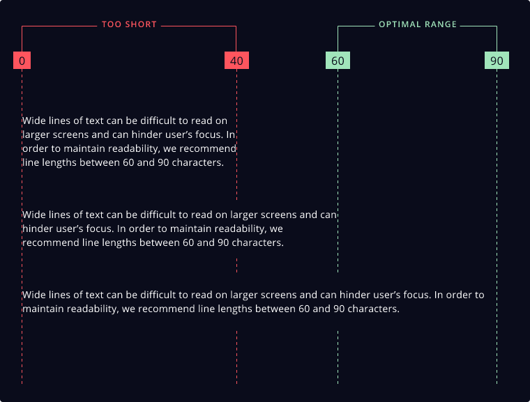
Wide lines of text can be difficult to read and can hinder user’s focus. In order to maintain readability, we recommend line lengths between 60 and 90 characters.

In scenarios where design needs require shorter character lengths, we strongly recommend reassessing content needs and attempting to condense text to a single statement.

optimal line lengths for accessibility

Package

All typography styles are available in the @featherds/styles package. See the Typography Guide for live demos and code examples.