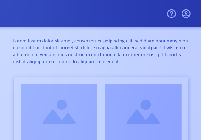
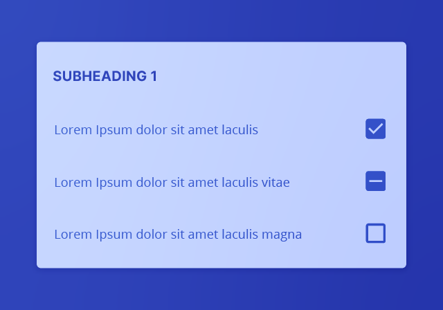
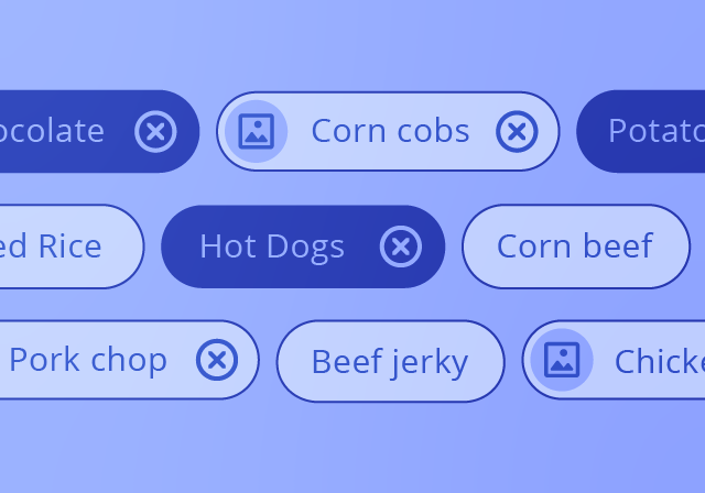
 
FoundationComponentsGuides
Feather DS
  • Components
  • Overview
  • App Bar
  • App Layout
  • App Rail
  • Autocomplete
  • Back Button
  • Badge
  • Button
  • Card
  • Checkbox
  • Chips
  • Date Input
  • Dialog
  • Drawer
  • Dropdown
  • Expansion
  • Footer
  • Icon
  • Input
  • List
  • Mega Menu
  • Navigation Rail
  • PDF Viewer
  • Pagination
  • Popover
  • Progress
  • Protected Input
  • Radio
  • Select
  • Snackbar
  • Table
  • Tabs
  • Textarea
  • Tooltip

Components

#All Components

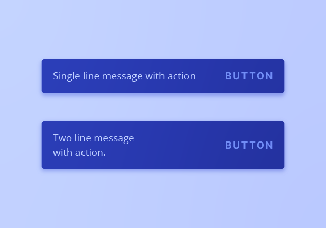
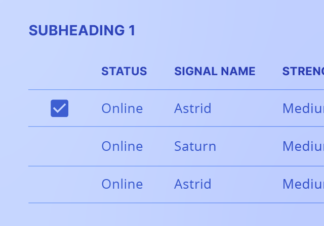
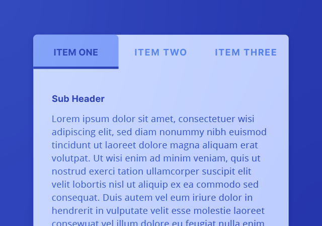
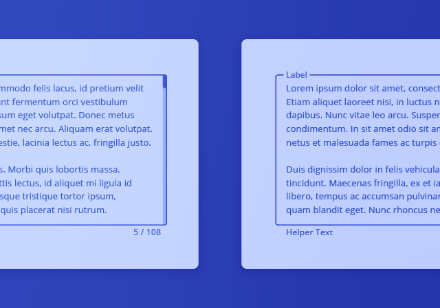
Components are the building blocks of Feather DS. Each component is designed to address a specific UI need.
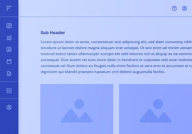
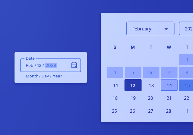
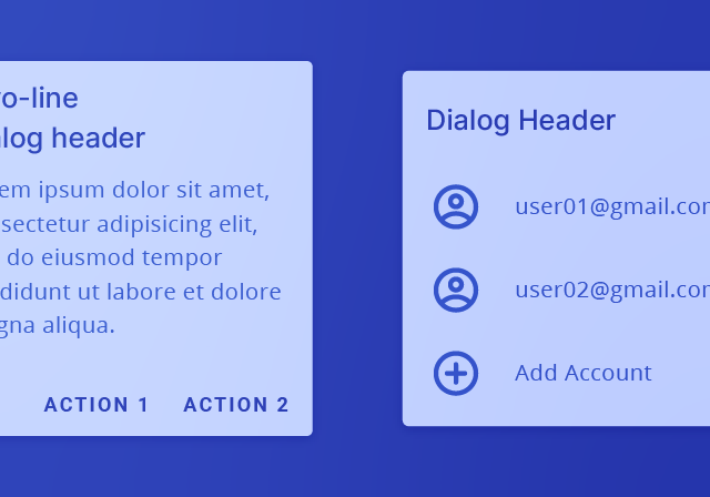
App Bar

App Layout

App Rail

Autocomplete

Back Button

Badge

Button

Card

Checkbox

Chips

Date Input

Dialog

Drawer

Dropdown

Expansion

Footer

Icon

Input

List

Mega Menu

Navigation Rail

PDF Viewer

Pagination

Popover

Progress

Protected Input

Radio

Select

Snackbar

Table

Tabs

Textarea

Tooltip

  • GitHub
  • Contributing
  • Licenses
  • Accessibility
  • NantHealth Blog
  • NantHealth Careers
  • OpenNMS Blog
  • OpenNMS Careers