Concept
In Feather DS, our concept of application layouts utilises 4 key elements;
- A main navigation bar
- An optional secondary menu or navigation bar
- The main content of the app
- An optional footer for links and other content
Primary navigation can be either horizontal or vertical, the rest of the components are optional depending on what best suits the application. Our implementation also provides a dedicated App Layout component that is able to facilitate and rationalise the arrangement of these primary components.
Components
Main Layout
App Layout
FeatherAppLayout is contained in the @featherds/app-layout package and is responsible for the overall layout of our application. It provides slots for us to configure the layout with the components we want. There are also two props; content-layout is responsible for the width of the content inside the layout. nav-layout determines whether navigation appears at the top or the left of the layout.
Horizontal Navigation
App Bar (Primary)
FeatherAppBar is contained in the @featherds/app-bar package and is responsible for creating an application bar that appears at the top of the application. This should only be used when nav-layout is horizontal, it should also only be placed in the header slot of FeatherAppLayout
Nav Rail (Secondary)
FeatherNavigationRail is contained in the @featherds/nav-rail package and provides a rail that can be used alongside FeatherAppBar to provide navigation. This should only be used when nav-layout is horizontal, it should also only be placed in the rail slot of FeatherAppLayout
Vertical Navigation
App Rail (Primary)
FeatherAppRail is contained in the @featherds/app-rail package and is responsible for creating a application rail on the left hand side. This should only be used when nav-layout is vertical, it should also only be placed in the rail slot of FeatherAppLayout
App Header (Secondary)
FeatherAppHeader is contained in the @featherds/app-rail package and is responsible for creating a header to supplement the application rail. This should only be used when nav-layout is vertical, it should also only be placed in the header slot of FeatherAppLayout
Footer
FeatherFooter is contained in the @featherds/footer package and is responsible for creating a application footer. It should also only be placed in the footer slot of FeatherAppLayout
Example Layouts
Horizontal Navigation
The App Bar layout utilizes the @featherds/app-bar package to create a fixed header along the top of the application.
The App Bar is a persistent surface that provides top-level navigation and actions for applications.
The app bar acts as a shelf for important actions that a user may need access to, regardless of location in the application hierarchy. App bars may contain elements and sub-components such as: icon buttons, select drop down menus, search bars, text-links, tabs and logos. Clicking these actions may result in direct forward or lateral navigation or the display of an overlay like a drawer or a popover.
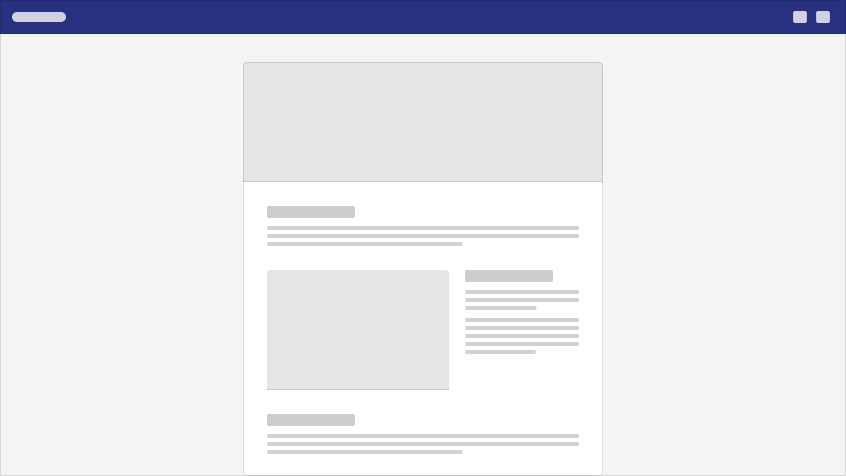
<FeatherAppLayout ...>
  <template v-slot:header>
    <FeatherAppBar ...>
  </template>

  <AppContent />

  <template v-slot:footer>
    <FeatherFooter ...>
  </template>
</FeatherAppLayout>
With Navigation Rail
The navigation rail layout builds on the app bar layout by adding a navigation rail to the left hand side of your application. It uses the @featherds/nav-rail package for the navigation rail creation.
The navigation rail provides persistent top-level navigation for applications that require the frequent non-linear navigation through the top-most levels of hierarchy.
Navigation Rails are meant to provide instant access to various functions of an application without requiring a user to switch to a dedicated navigation mode. Navigation rails may be collapsed to an icon-only representation, but remain visible regardless of a user's location in the application hierarchy. Since the Navigation Rail handles the top-level navigation, the App Bar assumes a secondary role, providing application-specific actions such as "search" and "user profile" only.
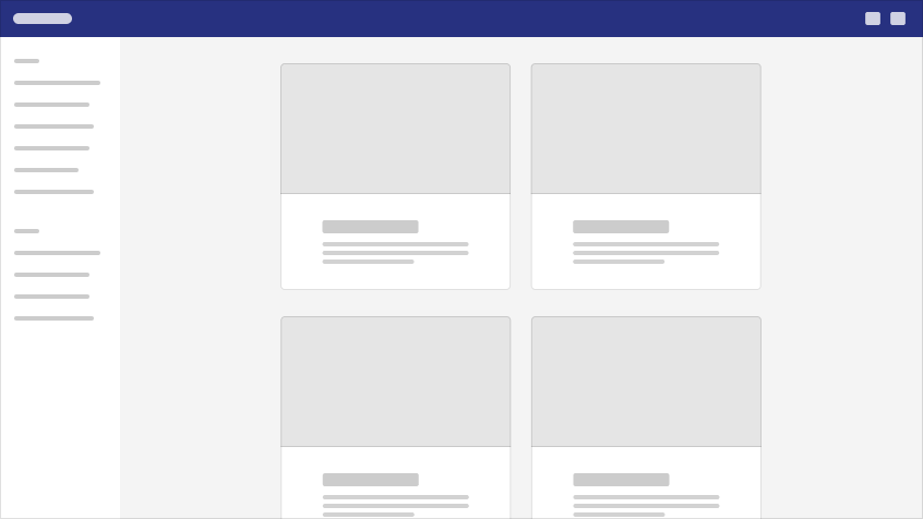
<FeatherAppLayout ...>
  <template v-slot:header>
    <FeatherAppBar ...>
  </template>

  <template v-slot:rail>
    <FeatherNavigationRail ...>
  </template>

  <AppContent />

  <template v-slot:footer>
    <FeatherFooter ...>
  </template>
</FeatherAppLayout>
Content Width
When using the app bar layout the content can either appear full width or centered. When centered the content will be limited to a width of 75rem. Typically the app bar content will match the content width except when using a navigation rail, then the app bar content will always be full width regardless of what the content width is.
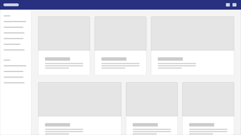
To set the content width use the contentLayout prop on FeatherAppLayout. More details about the prop can be found on the FeatherAppLayoutPage
Vertical Navigation
The App Rail takes the place of the App Bar, acting as the "branded" visual touchpoint in the UI layout. Similar to the nav rail, the app rail provides persistent top-level navigation for applications that require the frequent non-linear navigation through the top-most levels of hierarchy.
App Rails are meant to provide instant access to various functions of an application without requiring a user to switch to a dedicated navigation mode. Navigation rails may be collapsed to an icon-only representation, but remain visible regardless of a user's location in the application hierarchy. Since the Navigation Rail handles the top-level navigation, the App Bar assumes a secondary role, providing application-specific actions such as "search" and "user profile" only.
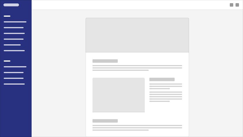
<FeatherAppLayout nav-layout="vertical" content-layout="full">
  <template v-slot:rail>
    <FeatherAppRail ...>
  </template>

  <AppContent />

  <template v-slot:footer>
    <FeatherFooter ...>
  </template>
</FeatherAppLayout>
With App Rail
The App Header is a secondary persistent surface in the UI that contains application-wide actions only (user profile, settings, notifications). App bars may contain elements and sub-components such as: icon buttons, select drop down menus and search bars.
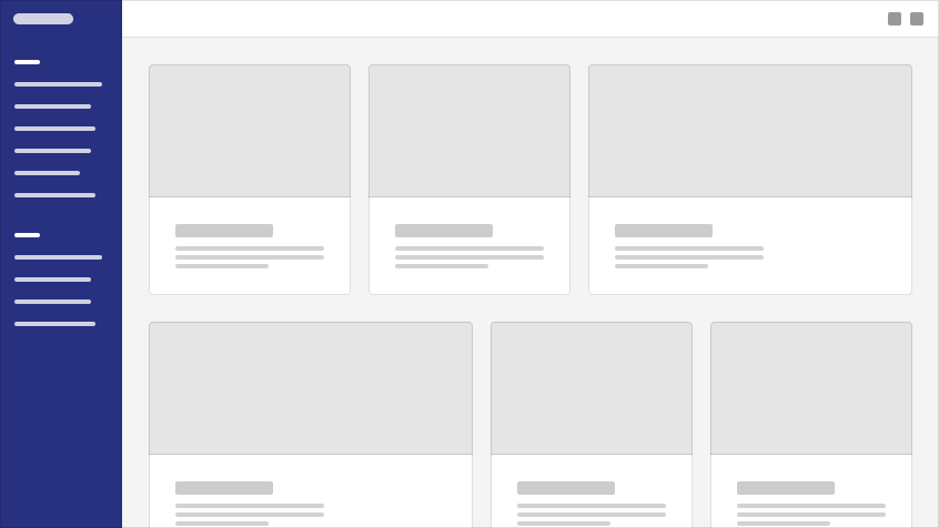
<FeatherAppLayout nav-layout="vertical" content-layout="full">
  <template v-slot:rail>
    <FeatherAppRail ...>
  </template>

  <template v-slot:header>
    <FeatherAppHeader ...>
  </template>

  <AppContent />

  <template v-slot:footer>
    <FeatherFooter ...>
  </template>
</FeatherAppLayout>